One crucial element that will help you build a strong brand for your legal practice is to come up with a professional logo.
You want your clients to recognize you, remember you, and tell you apart from competitors. Professionals in the legal industry often go with the traditional gavel and mallet.
Fortunately for you, this article will help you come up with a more novel, eye-catching great idea for a law firm logo that will set you apart.
Colors have meaning and evoke emotions. Your logo color is important because it communicates your brand message and speaks to your target customers.

It is imperative, then, to realize what emotion is every color linked to.
Colors & emotions:
Do you want to be seen as a strong litigator or be perceived as a partner that will be with them throughout the entire legal process?
Spend a little time thinking about the colors you will need to represent what your law firm stands for.
Pro tip: Remember that the colors you choose should be used across all your branding, including on your law firm’s business cards.
Depending on the brand personality you want to convey, you can choose to use either modern or traditional fonts.
Before making a pick, take these short tips into consideration:

It is okay to do away with the traditional gavel, justice scale, or law book design. In fact, if you want to come across as unique, we highly recommend it.
Your potential clients will typically search for the words “law firm”, “attorney”, and “lawyer” when searching for help with their case. They are not really looking for those traditional symbols mentioned above.
Pro tip: Make sure you have a solid legal seo campaign in place so you can show up for these queries.Once they visit your website, they want to see content that paints you as a professional law firm.

Your logo should be clear and recognizable, no matter the context. Consider the following pointers prior to sitting at the design table:
Simply ask yourself if your logo can endure the test of context and adapt to any environment. If the answer is no, then it is time to redesign.

A logo that showcases your expertise with specialty law will catch people’s attention. Consider designs that demonstrate your unique value.
For instance, if you specialize in personal injury, a logo with an art showing a person wearing a cast would very powerfully describe what it is that you do. A family attorney would have a representation of a family on its logo. Just remember to keep it stylish and modern.
Think of ways in which your design will tell clients if you either specialize in one of the two mentioned above, or divorce, elder, tax law, environment, or whatever the case may be.

In the legal industry, reputation is the name of the game. And people relate your reputation to your firm name. Make a strong statement by displaying the name of your firm in your logo in a distinct way.
In the future, once your logo has earned its reputation, people should be able to connect your logo with your name, without even having to read it. Consider what do you want people to think about when they see your name in the logo or only the art design on it.
Want to improve the brand awareness of your law firm? Our legal marketing services are engineered specifically to help you grow your reputation, lead volume & caseload.
As long as you did research your color scheme, you can get creative and add in non-neutral colors. As you probably know, some colors do not really match and can make your logo look stuffy and/or overwhelming.
Apply the rules of complementary colors to decide which will be your best combination. We do not recommend using a large number of colors. Two to three colors in the same design should do just fine.
A logo is powerful if it clearly tells your clients what you can do for them just by simply looking at it. This also helps build positive perception to your brand when they associate your logo with positive connotations.

Fashion Law Institute’s logo communicates the business message of the company in a simple yet succinct way.
At first glance, It looks like a hammer. But if you look closely, the head portion is actually and thread and the handle is a needle.
Simple, clear, yet creative.

LGBT Law Center wanted a logo that communicates its goal of nurturing justice across time, societies, and sexual orientation.
That messaging is reinforced by this choice of typeface. The rainbow-colored polygons also make their logo stand out from the typical law firm logos.
This logo of TE Law Offices is in a geometrical shape put together using the letters ‘T’ and ‘E’. The letter ‘T’ at the center and the small blue lines also make the logo look like a scale, which is one of the symbols of justice.
Geometric shapes are made of patterns that are regular and provide a feeling of order and structure. The best part is that these patterns are easily recognizable. The fact that these shapes are regular gives a feeling of efficiency and organization.

The Jacob Law Firm’s logo incorporated unique elements such as the tip of a pen, green stems, and leaves. It is non-traditional in terms of symbols and colors and adds a tagline to further communicate what the firm does for its clientele.
A tagline is a short text that describes everything you do. In three to four words, you must be able to give your audience a complete scope of your purpose, mission, and vision. A tagline will help clients feel more connected to your firm.
Have these ideas in mind when coming up with a tagline:
It does sound like a challenge, right? Take your time to collect your thoughts and come up with something brilliant. Remember to search Google if your tagline is not already in use.

Pannu Law added a modern twist to the traditional shield commonly used in logos. Distinctive cuts were added to divide the shield into two portions.
Two shades of blue were also used. This color is usually associated with intelligence and friendliness. This is a great way to show that you can be conservative and modern at the same time.
The trend in design right now is going towards making flat logos. To make your logo stand out, you can add a gradient to it. Benakem Law’s copper gradient made its logo look even more elegant.
One important thing to consider is to not make the gradient the main point of your logo. It should only be used to give it an extra flair. This accentuates an already strong logo.

The classic typography of ‘L’ in gold is used as the centerpiece of Lahmann law’s logo. It exudes a strong sense of elegance, achievement, and prestige.
This is yet another example of simplicity with elegance.
Russell Law Firm was able to incorporate the pillar and the letter ‘R’ for its logo. This is another example of how you can add a creative twist to traditional law firm logos while making it memorable.
Keep in mind that shapes must portray elegance, regularity, and simplicity. Do not try to force a shape into a design. This might only make it appear too loaded or make it difficult for clients to understand it.
Monograms never go out of style. Why? Just because they work. If you create a balanced, eye-catching monogram for your logo, it is a good way to add credibility to your overall brand image.
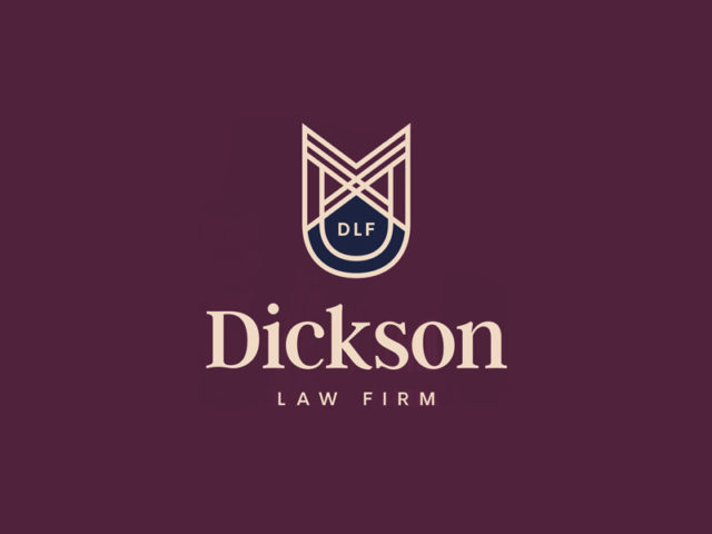
Looking at this logo from Dickson Law Firm, you can see that the main symbol used is a shield. But it’s more than just that. They were able to integrate the founder’s initials MDD into the shape of the shield with a subtle reference to the baseball history of the founder.
A meaningful logo shows individuality. It helps clients connect the person with the brand, which is very important in this line of work.

Goldman Law’s logo is another example of integrating letters into a pillar symbol (just like what Russell Law Firm did with theirs in the example above). This logo was able to execute this creative trick in a more subtle way.
As we have mentioned before, keep it simple and understandable. Pay attention to details such as balance, space, and symmetry.
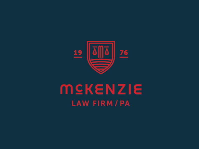
In the legal practice, the longer you are there, the more people trust you and your expertise. Mckenzie Law Firm made sure to include their date of establishment in their logo to show clients that they have many years of experience.

Kennedy Payne is a solo practitioner and decided that her full name will be conveyed in her logo in a straightforward way. It is also supplemented by her initials on the left-hand side. This logo is simple, clean, and easy to understand.

Thompson DC Law had another creative way of using the pillar symbol. They were able to incorporate the letter ‘T’ in it. The angled edges at the end of the lines also make the symbol more modern.
To this point, you are probably wondering if you have it in you to come up with your own creative ideas. Since this is a profession you chose because you love, it is easy to tap into that to get a logo that will tell others what you are about.
Here are some quick ideas to get those creative juices flowing:

In this logo, Alexander Law Group combined to traditional yet strong law symbols – justice scale and a sword. Creating an original symbol out of classics is not easy to pull off but once successfully done like this, it can greatly benefit your law brand.

As we have mentioned earlier, sometimes, less is more.
Your logo would be easily remembered and recognized by potential clients if it is easy to understand and look at.
Avoid having too many complicated symbols that people will most likely not remember. We recommend that you choose a simple logo that is straightforward in communicating who you are and what you do.
Hire a professional designer to do your logo for you-just like you would advise your clients to hire a lawyer instead of representing themselves.
Your legal practice’s logo will represent you moving forward in your professional practice. You have one shot to make it right. Changing logos along the way will hurt your brand image more than help.
Here are some benefits of hiring a professional designer to design your law firm logo:
If you want to hire a professional designer but don’t want to break the bank, check out 99 Designs. They work with you until you get exactly what you want or you get your money back.